Wednesday, April 27, 2011

Sick of the same old furniture? How about these little wacky fantastic pieces?!

Weird and Wacky Furniture By Straight Line Designs

Straight Line Designs is a one-of-a-kind workshop that has been operating out of Vancouver, British Columbia for the past 25 years. In addition to installations, sculptures and private commissions, designer Judson Beaumont and his staff of eight full-time craftspeople have designed and constructed a variety of wacky cartoon-style furniture and projects for public institutions and children’s exhibitions throughout North America and abroad. Focused on quality and custom design, Judson’s studio stays far away from mass production and is as imaginative as children themselves.

StaightLineDesigns.com


Neat, huh?! :)

Better late than never?

Well... lately I have been the most awful blogger. EVER. To be honest school and work has been kicking my ass and I basically only have one thing on my mind. VEGAS (and getting skinny for Vegas). I leave 3 weeks from today! OMG.

Anyways as I was browsing around the internet looking for fabulous items and inspirational elements I came across this super cute table lamp! Thumbs up Pottery Barn! You always make me smile! How amazing is the lamp?!?! It's has an atrium base for loads and loads of creativity. Check out some of their ideas below! Only $149! Love this!


 http://www.potterybarn.com/products/atrium-glass-table-lamp/?pkey=ctable-bedside-lamps

Tuesday, April 5, 2011

Paint Technique: Antiquing Furniture

Antique finishes on furniture are one of the latest trends being seen everywhere! Below I have some step by step instructions on how to turn any ordinary piece of furniture into a stunning antique with just some paint and glaze!


Materials:
unfinished piece of furniture (Ikea bedside table, Aspelund, Natural)
oil-based primer
2 colors of satin-finish paint
paintbrush
stencil
small foam roller
dark paint and glaze mixture
rag
cheesecloth
polyurethane
Steps:
1. Cover an unfinished piece of furniture completely with an oil-based primer. Let dry.
2. Apply the base coat of paint. A satin finish will make applying glaze easier. Using paint with a flat finish can make the glaze blotchy. Applying paint with a paintbrush gives your piece an aged look while using a foam roller creates a smoother finish. Let dry.
3. Place the stencil in desired location, paint over it and use a damp rag to easily wipe extra paint off the satin finish basecoat. Carefully remove the stencil.
4. For the antique look, mix a glaze by adding one part dark brown paint to three parts glaze. Stir thoroughly. Brush the glaze generously across your piece. If you have a large piece of furniture, work in sections to avoid drying lines. Wipe the glaze off right away using either a rag or cheesecloth. Cheesecloth gives you a smoother finish and a rag gives you a wiping effect. Continue applying glaze and wiping it until you achieve your desired finish. If you mess up, use a damp rag and the paint will easily wipe off the satin finish basecoat.
5. Highlight all of the architectural features by taking the same glaze and brushing it into the crevices of door or drawer fronts. Wipe off excess.
6. To highlight the edges of your piece, take the brush with a little bit of glaze on the tip and running it along all of the edges at about a 45-degree angle, leaving a line of glaze.
7. After your glaze dries, add a coat of polyurethane to protect the finish.


For more information or for additional painting ideas please refer to  http://www.hgtv.com/painting/index.html

Tuesday, March 22, 2011

Be BOLD

No room for scaredy cats here! This inspiration board is my idea of what is hot and fantastic RIGHT NOW!  Mix, mix, mix! Pattern, pattern, pattern! Texture, texture, texture! Be BOLD. This look is all about mixing and matching, but also being able to find that common ground. My common ground is black and white. It ties everything together and makes everything work beautifully with one another regardless of the pattern. You do want to have some variations. I first started with my “inspiration” fabric. This happens to be the beautiful purple patterned one I have chosen to put on a chair. I wanted to keep my sofa clean but I needed some interest so I chose a grey textured upholstery with sort of a rustic, canvasy feel, grabbing ones attention but not stealing the show. I needed some fun… so BOOM! Zebra upholstered square ottoman!-Creating the perfect marriage between the sofa and chair. For my drapery I knew I wanted something airy but I also wanted to pull in one last pattern… ta duh! Gorgeoussssss black, white and grey airy floral print drapery set upon my punch of color… LIME GREEN accent wall!-Perfect complementary color! The hard part is over, accessorizing is easy breezy! I chose some fab accent pillows, and a funky frame, mirror and vase of fun flowers turning this space into a BOLD but beautiful seating area! Fun right!?


The National Opera House turned Steelpan Academy

First and foremost, please excuse my lack of blogging during the past week or so... one word. Finals.

So anyways... for one of my larger projects this quarter I have been working on the restoration and transformation of The National Opera House located in the Homewood area of Pittsburgh, PA. The National Opera House is a non-profit organization with 501(c)(3) status, whose primary goal is to restore and maintain the original National Negro Opera House in order to teach culture through arts and music to the youth of its local communities. The programs of the Opera House are designed to create a bridge between members of the community of every age, race, background, and interest through music. These goals will be achieved through the creation and operation of the first school for steelpan performance in the state of Pennsylvania. For more information on this historic building, or perhaps to donate please refer to the following link! http://www.nationaloperahouse.org/

For my design proposal I have focused on first restoring this building as much as possible to it's original state and really focusing on the Queen Anne style elements in the architecture of the building, and then applying that over all look to my interior designs with a more updated, transitional style and decor! Check out my proposal boards below to really get an idea of my vision for the space!


Enlarged 3D Renderings

Thursday, March 10, 2011

Quote of the day:

     "Remember, color is not just color, but mood,   
  temperature and structure." 
-Van Day Truex

Wednesday, March 9, 2011

Remember my Moroccan inspired board?

Check out this awesome DIY project I found on Design Sponge to complete your Moroccan look!


Love these? You can do it yourself! 
Refer to the link below for materials, instructions and more information!

http://www.designspongeonline.com/2011/03/diy-project-moroccan-lanterns.html
 

Monday, March 7, 2011

Traditional Living Room


Traditional style living rooms are typically used as a sitting room or parlor area. Or in other words, the room without the flat screen. When designing with a traditional style in mind there are a few key elements to keep in mind that may help. The look is traditionally more formal with classically designed furniture arranged in an inviting way for entertaining, whereas modern living rooms or family rooms are typically designed for informal family gatherings and tv viewing. When you're designing your traditional space it's a good idea to incorporate a mix of both traditional and modern elements to create a space that is usable and comfortable. Decorative wooden legs such as the chair above give the room an instant look of timelessness and tradition. Soft lines such as the curved back and arms on the sofa above give the traditional look whereas most modern pieces of furniture are made made of hard, straight lines. Instead of arranging your furniture to focus on something such as a television, create a layout that is conducive to conversation. Include antique elements, or faux-antiques such as the chandelier and sconces above to bring a look of age and tradition to the space. Last but not least- dramatic window treatments. Because traditional living rooms were used for entertainment of important guests, window treatments were often designed to add a touch of drama to the room.Create this look with heavy, rich fabrics arranged in a way such as the sketch above. Use my few pointers and you're on your way to a gorgeous and timeless traditional living room.

Quote of the day:

"Design is not just what it looks and feels like. 
Design is how it works."
-Steve Jobs

The LOOK for LESS


So do not get me wrong... you get what you pay for! But when you're on a budget and you see something you love, but just can't afford chances are there is something very similar to that piece out there that is much more affordable! Yes- it probably won't last as long, but in some cases does it really matter? In the case of a sofa? Yes. In the case of a mirror or vase (something that isn't subject to daily wear and tear)? Not really. In my opinion if you trying to watch your spending, which we all are these days, then spend a little more on the important things and maybe a little less on the accessories. Look for sales. Look for similar pieces. Don't jump on that one chair because you love it and then feel guilty about it later! Look around. Wait, and like I said chances are there will be another piece very similar out there at much lesser price point! Now, don't look for 3 years people! You are NOT going to find it EXACTLY the way you saw it at the higher price point!... but maybe low enough to spare on some minor details. Happy shopping! :)

Friday, March 4, 2011

How To: Look Fabulous & Professional on the Job This Season!


Want to look great on the job?! Not sure how to look stylish and professional at the same time? Easy! I'm a true believe that if you feel great and look great then your confidence will really come through and bring out a side of you that is very attractive to those around you! Perfect for sealing the deal or giving that presentation you've been dreading right!? Seriously it's true, as long as your comfortable and feel great your mood will improve! Check out my inspiration board above for some great ideas! Pair a soft print silk blouse with a pencil skirt and a great pair of sling backs! Accessorize with an amazing briefcase, some simple jewelry and complete the look with an easy updo and a soft shade of pink or a neutral polish on the nails (Please no fake nails!-tacky, tacky, tacky!... just file those babies down to just above the finer tip, give them two coats of polish, a sealer and you're good to go!) Go get em' ladies!

Contemporary Chic Living Room


Love this look? Then you are contemporary chic! Creating this look is actually pretty simple, with only a few things to keep in mind... clean lines, sleek, geometric, and shine. When creating this look I knew I wanted to keep my color scheme pretty simple. I decided to focused on white, black and a soft burnt orange with a calm cream paint color and touches of "chic glam" and shine in my accessories, furniture finishes and the nailhead trim on the sofa! I added some geometric printed throw pillows, a sleek wall mirror, a pair of abstract paintings and contemporary shelving to tie it all together, creating this FABULOUS look! Like?

Thursday, March 3, 2011

Quote of the day:

"If every piece is perfect the room becomes a museum and lifeless."
--Nancy Lancaster

Monday, February 28, 2011

How to accessorize your mantel


Having trouble accessorizing your mantel?... Not quite sure what to put on that thing? Looking a little blahh? Looking a little busy!? No problem! Check out my 3 very different ways to accessorize your mantel! Whether you want to create a clean contemporary look, a transitional country style, or a funky fun look... you name it... there are always 3 things to keep in mind for creating the perfect mantel display. -----> Focal point, Balance & Proportion!

*Sure a fireplace in most cases is the focal point of the room but the display needs it's own focal point to direct your eye. In most cases you will see a centered mirror or piece of framed art hanging above the mantel like I have created above. This is a great way to get started but it's also cool to create more interest with something such as a mirror collage. Yes, it varies  in shape, but it is still centered and balanced together. When accessorizing it's best to keep things even, for example each of my mantel displays happen to have taller, similar in proportion pieces on the ends and small pieces, similar in sizes in between.This creates balance and a look of completeness. Have fun with your mantel! Change it up for holidays or for each season! Just keep focal point, balance and proportion in mind and you're good to go! I hope this helps!

French Country Dining Room


So previously in my blog I talked about french country design and decor... the focus of this board is a french country inspired dining room. I love this look. It truly is my personal favorite right now. It's so soft, calm, and beautiful yet cozy and warm! I really cleaned things up for this room keeping a pretty neutral color scheme focusing on the natural textures such as the rustic finish of the table and chairs, the wicker and frame of the chair at the bottom of the page, the relaxed construction of the chosen area rug and the distressed accessories and chandelier bringing warmth into the room. I added small touches of elegance with the amazing Parisian chest set gorgeously in between the two wicker back chairs, each topped with a soft moss green accent pillow. The clean cream side chairs are simple yet elegantly constructed with a beautiful nail-head trim of the same finish as the hardware on the chest. Decorative chair cushions on the wooden chairs and a soft painting set against a warm gold accent wall give this space just the right amount of color!... Leaving you with the perfect french country dining room.

Sunday, February 27, 2011

Moroccan seating area inspiration board


So what do you think about a Moroccan style? Doesn't it just make you want to sit on the floor, light some incense and smoke from a hookah?!... Well, maybe not really at all but you know what I mean. It is cool! Moroccan style and decor is all about deep rich colors of burnt oranges, deep reds, pinks and purples with shades of yellows, blues, teals and greens like the ones above, mixed with different textures of silks, sheers, velvets, etc. It's all about color, pattern, texture and beauty! To me it's almost like a room wearing jewelry!~Fun jewelry! Check out the beading and details on the pillows mixed with the metallic gold accents in the mirror and the floor seat! I chose the lamp because of it's colors and that fact that it reminded me of some sort of magical genie bottle! Often times Moroccan styles have a ceiling made of different colored fabrics draping from side to side (or in the case of a Moroccan style bedroom- definitely include a hanging canopy above your bed! ) Hanging lighting fixtures and lanterns are also used to create a beautiful ambiance and awesome decoration! Follow this board for inspiration and you'll have no problem creating a Moroccan styled space! Good luck!

Quote of the day:

“I don’t think of decorating as a science or a discipline. People always say start with the rug, but it is often the last thing I end up selecting. I begin with whatever makes my heart sing.” 
-Design shop owner Deborah Buck

My little wish list...


God do I love shopping~shopping for clothes, furniture, accessories, art, shoes, you name it!... and although I am an interior designer, fashion falls directly behind, if not side by side with my love for interior design and decorating! To me you should have just as much fun dressing yourself as you would dressing your home and vice versa! For as long as I can remember I have always had a love and flare for both... and often debated which direction I wanted to take in my career. In the end I decided that interior design was a more rewarding career for me and fashion would stay a very close love and passion of mine. With that said, frequently I will create little idea boards like the one above just for fun and again, *inspiration* for what's in this season! So, what do you think of this look?! I love it! Like the board reads, this is a perfect day outfit for spring giving you a clean, classic and casual look. :)

Trash to Treasure


A headboard made from salvaged materials can add tons of charm and unique style to a bedroom. In this space, an old door found in a burn pile was paired with a vintage gate — reclaimed from a dump and brightened up with a mist of white spray paint. The end result is a whimsical, one-of-a-kind headboard with enough substance to balance the king-size bed. Design by Funky Junk Interiors.

Eclectic living room inspiration board


Think your style is eclectic but not quite sure how to make it work?  Eclectic is all about mixing old with new, antiques with contemporary, or mixing old frame styles with modern upholstery or fresh bright paint colors. Don't be so quick to throw away your grandmothers antique chandelier and wall mirror!~They look great mixed with bright pops of color and texture on modern furniture. I love the look of an antique style chair or sofa covered in modern upholstery like the ones above, creating a more casual look. Also, don't worry about matching! If you love the look of a rustic trunk for a coffee table pull it in! If you love the look of a cowhide area rug, use it! Have fun with throw pillows, the more colors, textures and patterns in this case the better! The great thing about Eclectic is EVERYTHING works as long as it all ties together in some way!

Quote of the day:

"It is just as disastrous to have the wrong accessories in your room as it is to wear sport shoes with an evening dress."
~Dorothy Draper

Saturday, February 26, 2011

Need some inspiration for SPRING 2011!? Check out my style watch board for the lastest & hottest trends of the season!


SPRING 2011: I tend to be a lover of both fashion and interior design, and I truly believe the styles, trends, colors and textures of each season in some way go hand in hand. I mean seriously look at that amazing 60's inspired dress by Michael Kors, mix it with Jessica Simpson's to die for turquoise platform sandals and... HELLOoOo~ the "shagadelic" bright floral print chair by Pier 1!!!... Seeing the similarities yet?! I know you do...With that said, another hot, hot trend is the soft blues, greens and neutrals with pops of color and patterns such as the living room scene to the top of the board and that adorable Pottery Barn pillow! I love how the pillow works both with the Pier 1, almost country style dining set AND the "shagadelic" contemporary/retro style Pier 1 arm chair... *tying it all together!* As you can see from this seasons spring inspired paint colors I pulled from Benjamin Moore, this whole color scheme works so well with one another! Alrighty my guys and gals, with that said... Have fun with color this season!

OMG! How could I forget to mention that amazing silver metallic end table!? SO CUTE right? And so in!
*Designer's Tip*: To get this look (so easy!)...
1.) Find any old table that you find cute in shape but lacking in color or finish.
2.) Lightly sand off the first layer of the piece and any rough patches creating a smooth finish.
3.) Apply a spray paint primer. (I tend to use Valspar)
4.) Allow for proper drying time as suggested on the bottle.
5.) Apply a silver metallic spray paint finish (again, I know Valspar carries this finish) and allow for proper drying time.
6.) TA-DUH! You just created this amazing look for so cheap!... and so easy! :)

Friday, February 25, 2011

Quote of the day:

“matchy-matchy is not for me. I don’t want things to be too perfect. It’s like pairing a matte top with a shiny skirt, so they play off each other. I want there to be relationships with texture and color, and sometimes it’s more about the contrast that chimes."
~ peter so

Thursday, February 24, 2011

Current Obsession: all things French Country

Soft colors, vintage pieces, natural materials, burlap, cotton and linen fabrics of prints and patterns such as birds, butterflies, floral, and french motifs, mixed with-MY FAVORITE-distressed furniture, art and accessories!...will give you the charming yet cozy inviting feel of "French Country". Check out these lovely pieces with a French Country influence from 2 of my favorite's: Pottery Barn & Ballard Designs.
http://www.potterybarn.com/
http://www.ballarddesigns.com/


So next on my project to-do list!


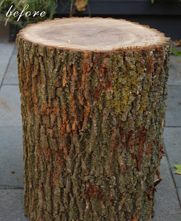
Check out this awesome little table I found on Design Sponge! So cute and pretty easy to make... I'm itching to make one of my very own!-Thanks Karen!

Refer to the link below for materials needed, instructions and more information!
http://www.designspongeonline.com/2011/02/before-after-karens-log-table-jaimes-jewelry-display.html

Quote of the day:

“I don’t think people have enough fun with decorating. It doesn’t always have to be so serious. Design isn’t like marriage. You don’t have to commit for life.”
~Ross Cassidy

Wednesday, February 23, 2011

Patch me up!


So into patchwork upholstery right now! So fun. So colorful. So unique! Check out these GORGEOUS pieces!- LOVE. (The first one is from Viva Terra!-AMAZING stuff!)